
Hi, lovelies!
It’s been a while, but here we are again to talk yet again about the insane journey of an indie author, aka me, and perhaps you have been through something similar.
I cannot believe it’s already been a year since I released Light Into my Yang into the wild, releasing a new novel is a whirlwind of emotions, that always makes me excited, terrified, and a whole lot of guessing with just enough twist to my gut to go along with it.
As a self-published author, I have learnt to wear every hat. Because you are most likely the writer, the editor, the marketer, and the final but scary one: the art director. When I first published the book, I chose a cover that I thought was beautiful in its simplicity, and I drew it on a notebook, considered the implications of it, and decided to go ahead.
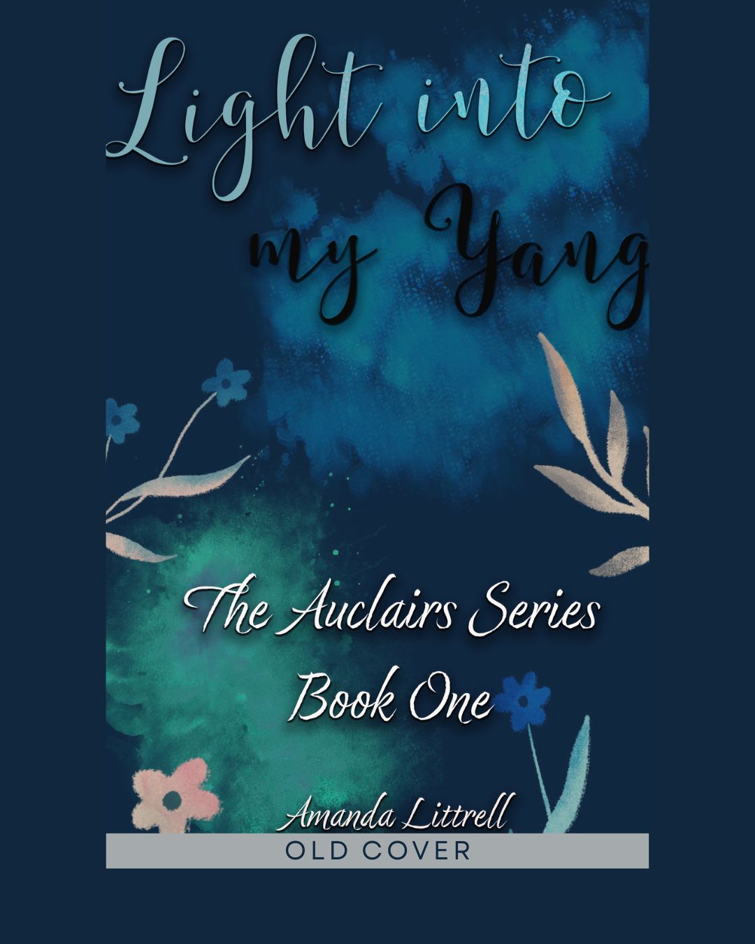
I still have a soft spot for this blue minimalist design. It’s clean, it’s abstract, and it was the face of my book for its first year of life.
But over the last months, as I’ve watched the romance genre evolve and saw the little interaction that readers were having with it, I realised something hard: this cover wasn’t doing its job.
It was pretty, but it was silent. It didn’t whisper (or shout) to you about what was actually inside the pages. It didn’t convey the cosy dorm vibes, the late-night study sessions, the tension of roommates realising they are more than friends, or the emotional depth of Adelinne and Logan’s story.
It was an abstract cover for a very real, messy, and emotional college romance, more of which is on the Behind The Story here on the blog.
The “Why” Behind this Change
I realised that if I wanted this story to find readers who would truly love it, the outside needed to match the inside. So, *sigh* I needed to stop hiding behind minimalism and embrace the mood.
I wanted a cover that felt “lived in.” I wanted something that captured that specific “what is this feeling?” and “this is my best friend, it cannot happen” vibes. I wanted shadows and warmth, literally putting the “Light” into the “Yang.”
It was a scary decision to re-brand a book that was already out there, and for such a short time. But I owed it to the characters to get it right.
It’s a New Era
And so, after much searching and agonising over the perfect vibe, I am absolutely scared and happy to reintroduce you to Light Into My Yang.

Isn’t it pretty? Isn’t it more me than the one before? If you have read some of my books, and seen the other covers, I think you will agree.
When I saw this concept, I knew this was it.
That messy couch, the crumpled notebook pages, the lonely coffee mug sitting in a patch of golden sunlight while the rest of the room is in shadow, is Adelinne mostly, I won’t lie, but it is also, life at college for Logan and Adelinne; it feels like a snapshot taken right out of their shared apartment. It feels intimate, like we just walked in on them after a long night of talking, arguing, or denying their feelings… again.
If you’ve already read Adelinne and Logan’s story, thank you for being here from the beginning. I hope you love their new look as much as I do.
And if you scrolled past this book a year ago because the old cover didn’t grab you, I invite you to take a second look. The story inside hasn’t changed, it’s still the same heartfelt, angsty college romance, but now it finally has the cover it deserves.
Light Into my Yang is available now on Amazon – Kindle with its brand new face!
And on Smashwords, Barnes and Noble, Kobo, Apple, and many other online stores. I hope you will read it and love them like I do, because there is a lot more Auclair where that came from…
Cheers!
BTW: If you’re still seeing the old book cover, sorry about that, it takes time for it all to reload.

Leave a comment